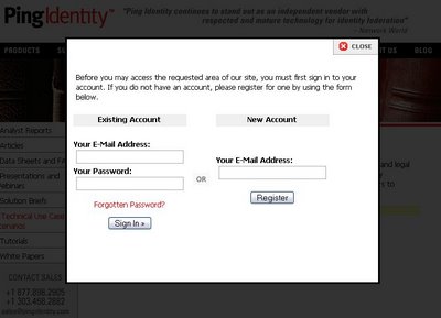
For the first time, I've seen this visual paradigm used elsewhere. When you try to login to Ping ID to access their information library (which I resent by the way) the rest of the browser screen is greyed out except for the account/password prompt window. Additionally, I can't do anything else in that window but deal with the dialog (see below)
 Not sure what to make of this. One of the purported justifications for the Cardspace 'greying-out' is to produce a visual effect that would be difficult for a phish site to recreate. But, any phish site could recreate the effect within the browser and it's modal only within the browser (actually only within the tab).
Do semi-modal dialogs diminish the power of those that are fully-modal?
No comments:
Post a Comment